
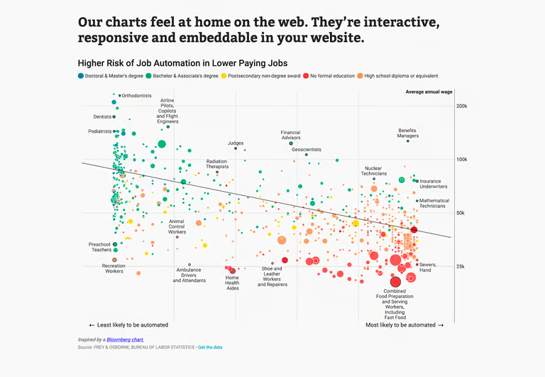
Big data is not always easy to consume. Large data sets can occasionally make it utterly impossible to extract any usable information from them. Data visualization can help with that.
The graphical representation of data is not an easy thing to do. Designers can’t just start from zero with a data collection with tens of thousands of entries and produce a visualization, after all. Yes, it is technically feasible, but who wishes to put in dozens or even hundreds of hours plotting dots on a scatter chart? Fortunately, there are many beginner-friendly data visualization tools available that can help simplify the process.
In this blog post, we will explore eight of the best data visualization tools that are easy to use and require little to no prior experience. Whether you’re a student, a data scientist, or someone simply interested in exploring data visualization, these tools will help you create stunning visuals that convey valuable insights. So, let’s dive in and discover some of the best data visualization tools that can help you unleash the power of your data!
What is Data Visualization?
The process of graphically representing data in the shape of heat maps, charts, sparklines, infographics, or statistical graphs is known as data visualization.
Data displayed with visual components are simple to comprehend and analyze, making it possible to effectively extract useful insights from the data. The results can then be used by pertinent parties to guide their decision-making in the present.
The visual depiction of data is facilitated by data visualization tools that include support for streaming data, AI integration, embeddability, collaboration, interactive exploration, and self-service capabilities.
Read more: What is Data Visualization and Why is it Important?
What is a Data Visualization Tool?
Find out what a data visualization tool is in general before we begin our inventory.
It is software that, in a nutshell, transforms data from a particular source into graphic charts, graphs, tables, dashboards, and the like.
The output of data visualization tools can range from straightforward pie plots to intricate interactive choropleth maps. Choosing visual tools with the appropriate characteristics is the trick. Not every instrument for data visualization is the same. While some tools require a lot of studying, others are more adaptable and simple to use.
But what features do the top data visualization apps share? All of them provide common kinds of charts and data visualization. Pie charts, line and bar graphs, histograms, and pyramid charts are the most popular. You’ll need to compare different tools to determine which ones provide what you need at the best price and simplicity of use for more distinctive or intricate data visualizations.
1. Tableau
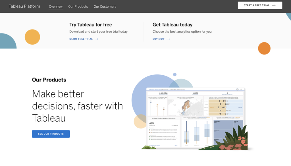
Data analysts, scientists, statisticians, and others can use Tableau, a tool for visualizing data, to see the data and form a clear opinion based on the data analysis.
It is well-known for its ability to quickly process data input and generate the necessary data display output. Additionally, it can accomplish this while delivering the highest degree of security and a promise to deal with security issues as soon as they appear or are discovered by users.
Tableau users can also organize, clean, and style their data before turning it into data visualizations that can be shared with other users to gain insights that can be put to use. Individual data analysts can use Tableau, or it can be used at scale by corporate teams and organizations.
How much does it cost?
- Tableau Public is completely free.
- Tableau Creator starts at $70 per license per month, billed annually. This tier is for connecting data sources and building visualizations.
- Tableau Explorer starts at $42 per license per month, billed annually. This tier is only for editing existing visualizations.
- Tableau Viewer is an online visualization option at $15 per user to see and interact with data visualizations.
2. Infogram
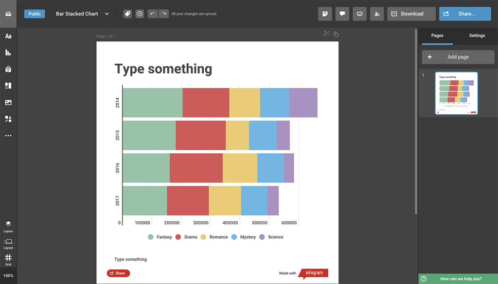
Infogram is a flexible online data visualization maker that is now a component of the visual tool Prezi. You don’t need a Prezi account to use the tool, which has a wide range of choices.
Due to its user-friendly interface, Infogram’s data visualization utility has been a favorite for a while. On Infogram, you can easily make data visualizations, and there is not much of a learning curve.
More than 40 different kinds of charts and hundreds of single maps are available in Infogram for customization. Recently, social media graphics and other images have been introduced for use with your visualizations.
The tool’s collection of dashboard template designs is a standout feature. These layouts gather a variety of visualizations in one location, making them ideal for identifying patterns in business data.
How much does it cost?
There is a free version of Infogram with limited capabilities, which is great for trying out the tool. Paid plans start at $19 for Personal plans and go as high as $149 for Enterprise plans.
3. Excel
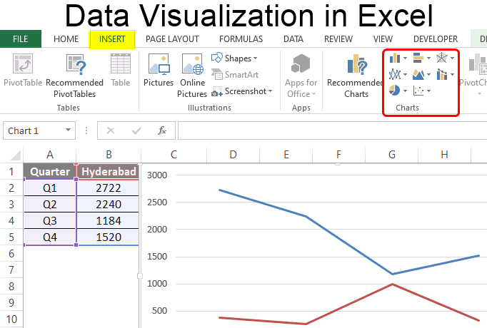
We frequently overlook the fact that the tried-and-true workhorse can sometimes complete the task without the need to obtain, install, or acquire any new skills in our haste to look for specialized tools.
One such tool that has endured and is a master of all crafts is Excel. It can be as useful a tool as any other in this piece, provided the requirement doesn’t go beyond creating simple bar graphs and charts.
Excel data visualization is well-known to the vast majority of Windows users, and Microsoft staff members have continued to improve it, keeping its standing.
It can perform many of the basic data exploration tasks (such as scatter plots and heat maps), but when you want to go beyond the predefined formatting choices for colors, lines, and styles, its limitations become apparent.
4. ChartBlocks
According to ChartBlocks, data can be imported using their API from “anywhere,” including live streams. Even though they claim that it only takes a few clicks to integrate data from any source, it is undoubtedly more difficult to use than other apps that have automated modules or extensions for particular data sources.
The end visualization produced by the app can be heavily customized, and the chart-building wizard assists users in selecting the ideal data for their charts before importing the data.
A major benefit for data visualization designers who want to embed charts into websites that are likely to be viewed on a variety of devices is that designers can make almost any type of chart, and the output is responsive.
5. Datawrapper
This utility is the easiest-to-use visualization tool and is a blessing for non-technical users. In contrast to this app, where no technical knowledge is required, creating visualizations requires technical abilities like coding.
Beginners who want to launch a job in data visualization should use the app the most. The most user-friendly tool for data scientists is this one. In media groups where there is a great need to present everything through stats and graphs, the tool is extensively used. The tool’s user-friendly interface makes it the most common option.
6. D3.js
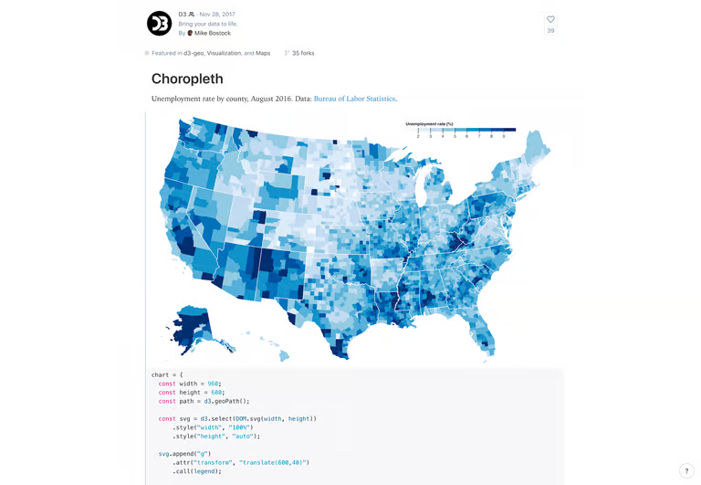
For creating interactive data visualizations in computer browsers, D3.js is a Javascript library. The best tool for working on data visualization is this one. The utility was first made available on February 18, 2011, and it was formally launched in August.
It is HTML, CSS, and SVG compliant. Developers can display data using artistic images and visuals. Although some JS understanding is necessary to use D3.js, some apps let non-programmers use the library.
It is a very flexible platform because it provides for the creation of various graphs in a variety of ways.
Read: Boost Your ROI with Advanced Social Media Analytics Tools
7. Google Charts
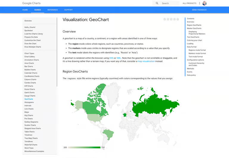
A strong, free tool for data visualization called Google Charts is designed especially for making interactive charts that can be embedded online. Because it uses dynamic data and only HTML5 and SVG for outputs, browsers can use it without the need for extra plugins. Google Spreadsheets, Google Fusion Tables, Salesforce, and other SQL systems are some examples of data sources.
Maps, scatter plots, column and bar charts, histograms, area plots, pie charts, treemaps, timelines, gauges, and many other kinds of charts are among the many different chart types. Through straightforward CSS editing, these charts can be fully modified.
8. Sisense
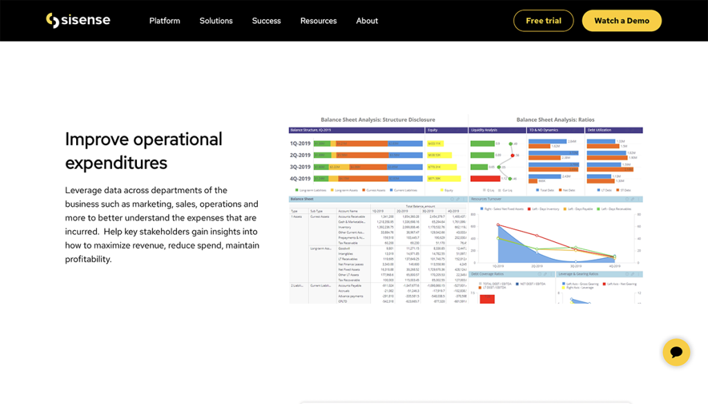
Data analysts can simplify complex data using Sisense, a business intelligence-based data visualization system, and gain insights for both their company and external audiences. According to Sisense, every company will ultimately be data-driven, and every product will be somehow connected to data.
For business teams and data analytics to assist in transforming their organizations into the data-driven businesses of the future, it makes every effort to provide them with a variety of data analytics tools.
Sisense is very simple to set up and understand. It can be quickly installed, allowing data analysts to complete their tasks and see outcomes right away.
Users of Sisense can export their data in a variety of formats, including PPT, Excel, MS Word, PDF, etc. Additionally, Sisense offers 24/7 customer assistance services for any problems users may encounter. Filling out a form will yield a price estimate.
Build The Software Your Business Needs To Grow
The next stage of your business will need better systems, smarter automation, and stronger digital tools. We help businesses turn ideas into websites, apps, and software platforms built for growth, revenue, and long-term scale.
Build For GrowthConclusion
With the help of beginner-friendly data visualization tools, anyone can create stunning visuals without prior experience in design or programming. The eight tools we have explored in this blog post are just the tip of the iceberg, and there are countless other options available for those looking to create effective data visualizations.
We encourage you to explore these tools and discover how they can help you unlock the potential of your data. So, what are you waiting for? Start exploring the world of data visualization today and see how it can transform the way you work with data!
Before you go…
Hey, thank you for reading this blog to the end. I hope it was helpful. Let me tell you a little bit about Nicholas Idoko Technologies. We help businesses and companies build an online presence by developing web, mobile, desktop, and blockchain applications.
We also help aspiring software developers and programmers learn the skills they need to have a successful career. Take your first step to becoming a programming boss by joining our Learn To Code academy today!